Quality Control Statistics
Figure 3
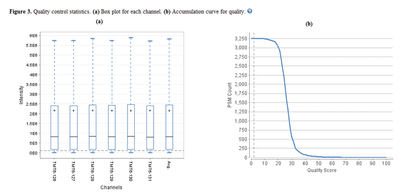
a) Box plot for each channel
Figure 3(a) displays quality control statistics box plots for the channel intensity distributions of all labels in the experiment. As a result, the horizontal dashed line represents the set reporter ion intensity threshold. Also, a plot displaying the average distribution for all labels is included.
b) Accumulation Curve for Quality
Figure 3(b) displays a plot comparing the number of PSMs that correspond to each peptide quality score. As a result, this plot provides a guideline in helping the user set an appropriate quality score threshold. It is recommended to set this threshold at the point in which the number of PSMs begins to dramatically drop.
More information on our website